

Style the interface
1
Open Appearance
Go to Assistants in the homie platform, select your assistant, and open Settings → Style.
2
Adjust the interface
Set the display name and headline, colors, header image, message placeholder, greeting message, suggested messages, and fonts of the chat window. The preview reflects each change instantly.
3
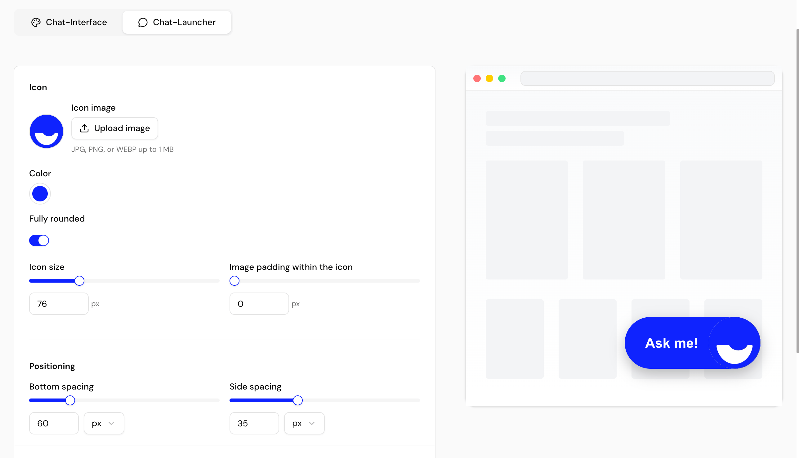
Configure the launcher
Choose the launcher icon (keep the default or upload your own), and set its color, rounding, size, image padding, screen-edge spacing, position, and hint text.
4
Check the preview and save
Confirm the look in the live preview, then save to publish your changes.
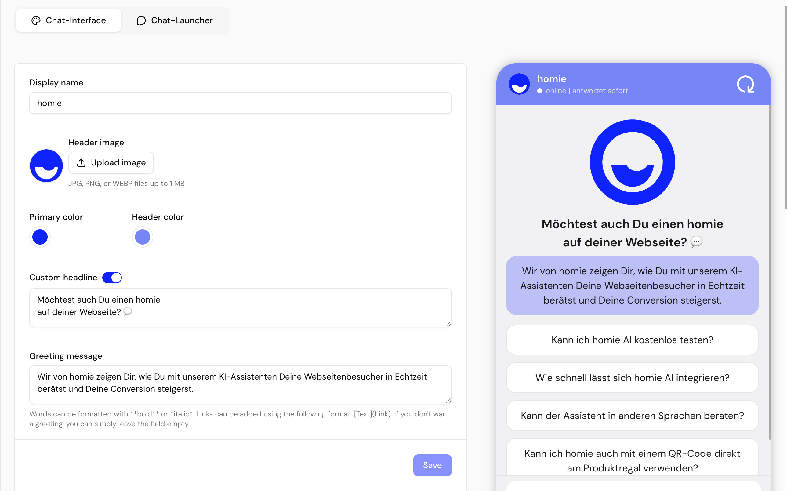
Interface options
Launcher options
Mobile view
The Size & positioning section has a Desktop and a Mobile tab. By default, the launcher is automatically shown slightly smaller on mobile devices. Enable Customize for mobile devices in the Mobile tab to set a separate size, screen-edge spacing, and position for mobile — for example to keep the launcher clear of a “back to top” button that only exists on desktop. The mobile settings apply on screens up to 640 px wide; the preview switches along with the selected tab.Next steps
Control widget behavior
Set the display mode and the Activation message.
Translate the interface
Localize launcher labels and chat strings.