> ## Documentation Index
> Fetch the complete documentation index at: https://docs.yourhomie.ai/llms.txt
> Use this file to discover all available pages before exploring further.
# Appearance
> Style the chat interface and launcher to match your brand, with a live preview as you edit.
Appearance controls how your assistant looks on your store: the colors, header, fonts, and content of the chat window, and the icon, color, position, and hint text of the launcher button. A live preview updates as you edit, so you can see every change before publishing.
## Style the interface
Go to **Assistants** in the [homie platform](https://app.yourhomie.ai), select your assistant, and open **Settings → Style**.
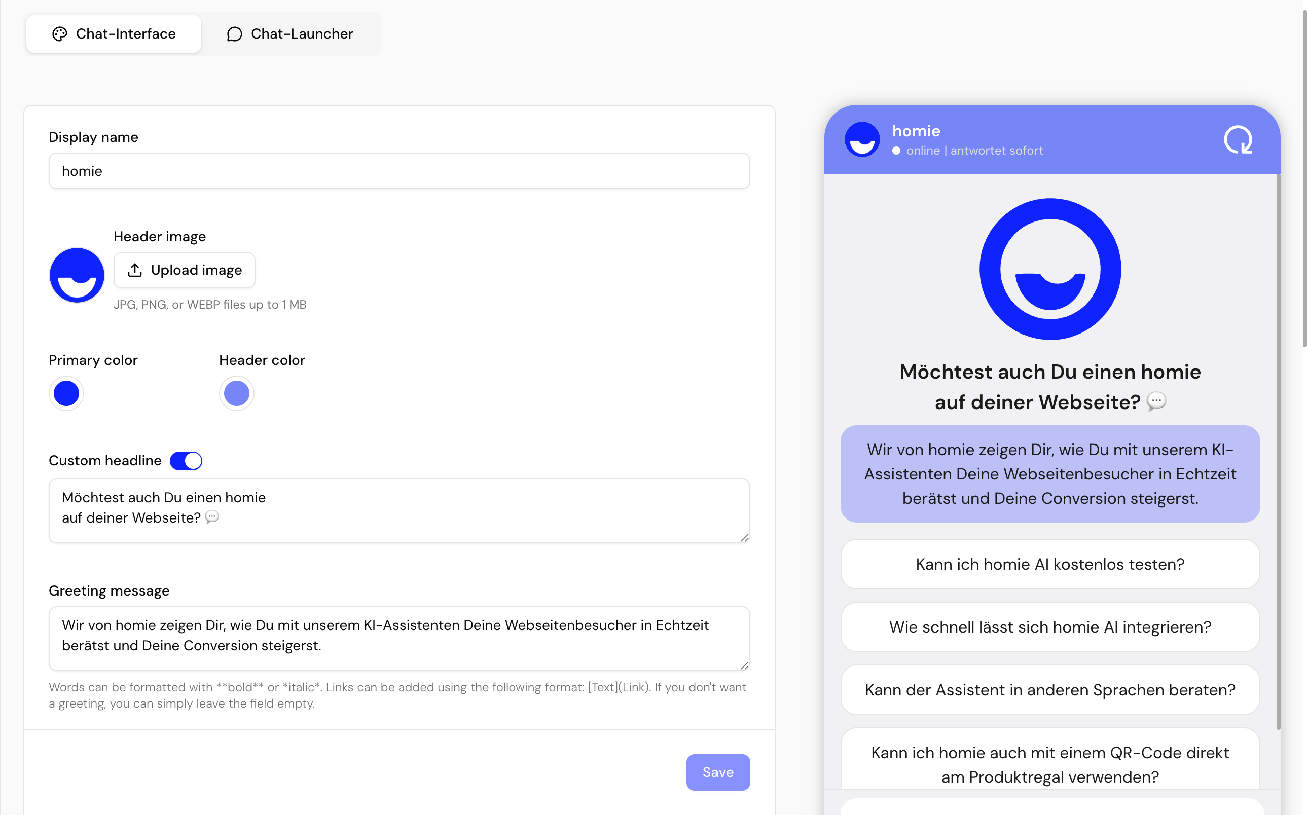
Set the display name and headline, colors, header image, message placeholder, greeting message, suggested messages, and fonts of the chat window. The preview reflects each change instantly.
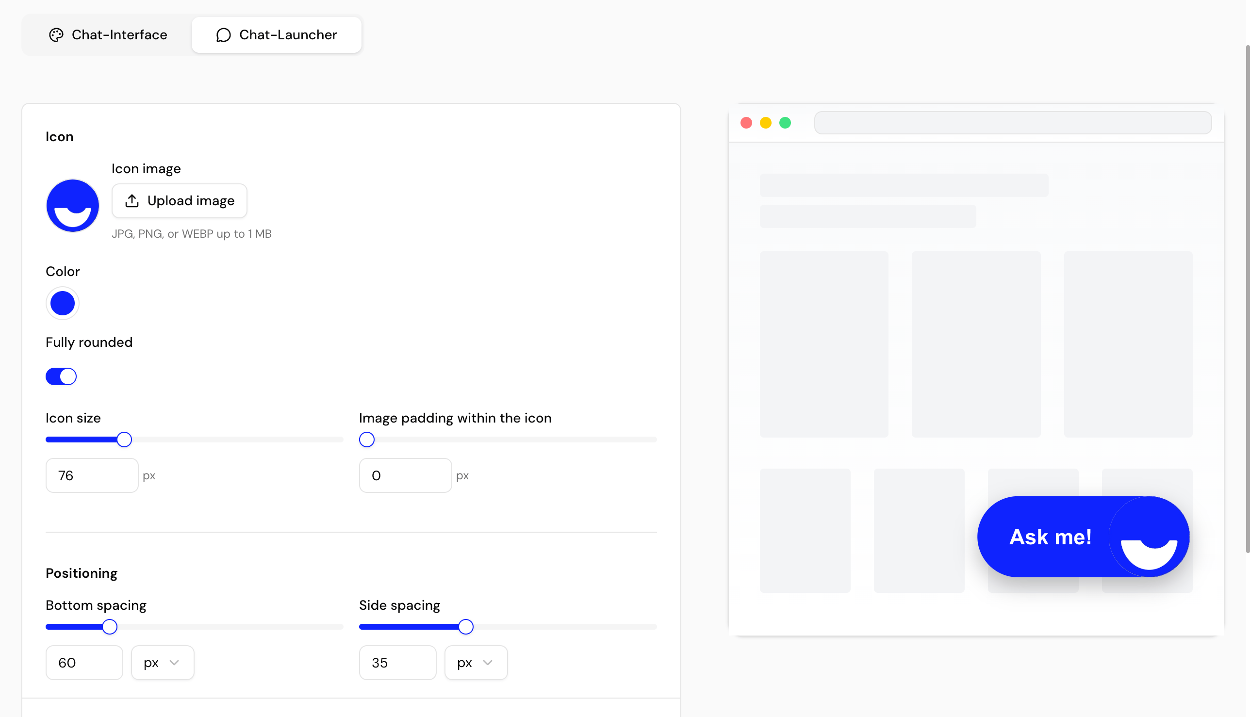
Choose the launcher icon (keep the default or upload your own), and set its color, rounding, size, image padding, screen-edge spacing, position, and hint text.
Confirm the look in the live preview, then save to publish your changes.
 ## Interface options
| Option | What it controls |
| --------------------------- | ----------------------------------------------------------------------------------- |
| **Display name / Headline** | The name and optional custom headline shown in the chat header. |
| **Colors** | The primary color, plus optional header, background, and user-message colors. |
| **Header image** | An optional image shown in the chat header. |
| **Message placeholder** | The placeholder text in the chat input field. |
| **Greeting message** | The first message shown when the chat opens. |
| **Suggested messages** | Sample prompts that help visitors start a conversation, optionally in random order. |
| **Fonts** | The primary and secondary fonts. |
| **Footer** | Optional footer content shown in the chat window (e.g. link to privacy policy). |
## Launcher options
| Option | What it controls |
| ------------------------- | -------------------------------------------------------------------------- |
| **Icon image** | The launcher icon — keep the default or upload your own image. |
| **Color** | The launcher background color. |
| **Rounding** | Make the launcher fully rounded, or set individual corner radii. |
| **Size** | The launcher button size. |
| **Image padding** | The spacing between the icon image and the button edge. |
| **Side & bottom spacing** | The launcher's distance from the edge of the screen, in pixels or percent. |
| **Position** | Launcher position, left or right. |
| **Hint text** | An optional label shown when a visitor hovers over the launcher. |
Match your accent color and launcher to your storefront so the assistant feels like a native part of your site.
## Next steps
Set the display mode and the Activation message.
Localize launcher labels and chat strings.
## Interface options
| Option | What it controls |
| --------------------------- | ----------------------------------------------------------------------------------- |
| **Display name / Headline** | The name and optional custom headline shown in the chat header. |
| **Colors** | The primary color, plus optional header, background, and user-message colors. |
| **Header image** | An optional image shown in the chat header. |
| **Message placeholder** | The placeholder text in the chat input field. |
| **Greeting message** | The first message shown when the chat opens. |
| **Suggested messages** | Sample prompts that help visitors start a conversation, optionally in random order. |
| **Fonts** | The primary and secondary fonts. |
| **Footer** | Optional footer content shown in the chat window (e.g. link to privacy policy). |
## Launcher options
| Option | What it controls |
| ------------------------- | -------------------------------------------------------------------------- |
| **Icon image** | The launcher icon — keep the default or upload your own image. |
| **Color** | The launcher background color. |
| **Rounding** | Make the launcher fully rounded, or set individual corner radii. |
| **Size** | The launcher button size. |
| **Image padding** | The spacing between the icon image and the button edge. |
| **Side & bottom spacing** | The launcher's distance from the edge of the screen, in pixels or percent. |
| **Position** | Launcher position, left or right. |
| **Hint text** | An optional label shown when a visitor hovers over the launcher. |
Match your accent color and launcher to your storefront so the assistant feels like a native part of your site.
## Next steps
Set the display mode and the Activation message.
Localize launcher labels and chat strings.